


The logo mark for this concept was created by using the different sectors making up Abacus. Working together, each section flows and interlinks with one another creating an overall bigger capacity and development.
This illustrates how Abacus adds value to properties by seeing their weakness and adding support/structure and building on from there.
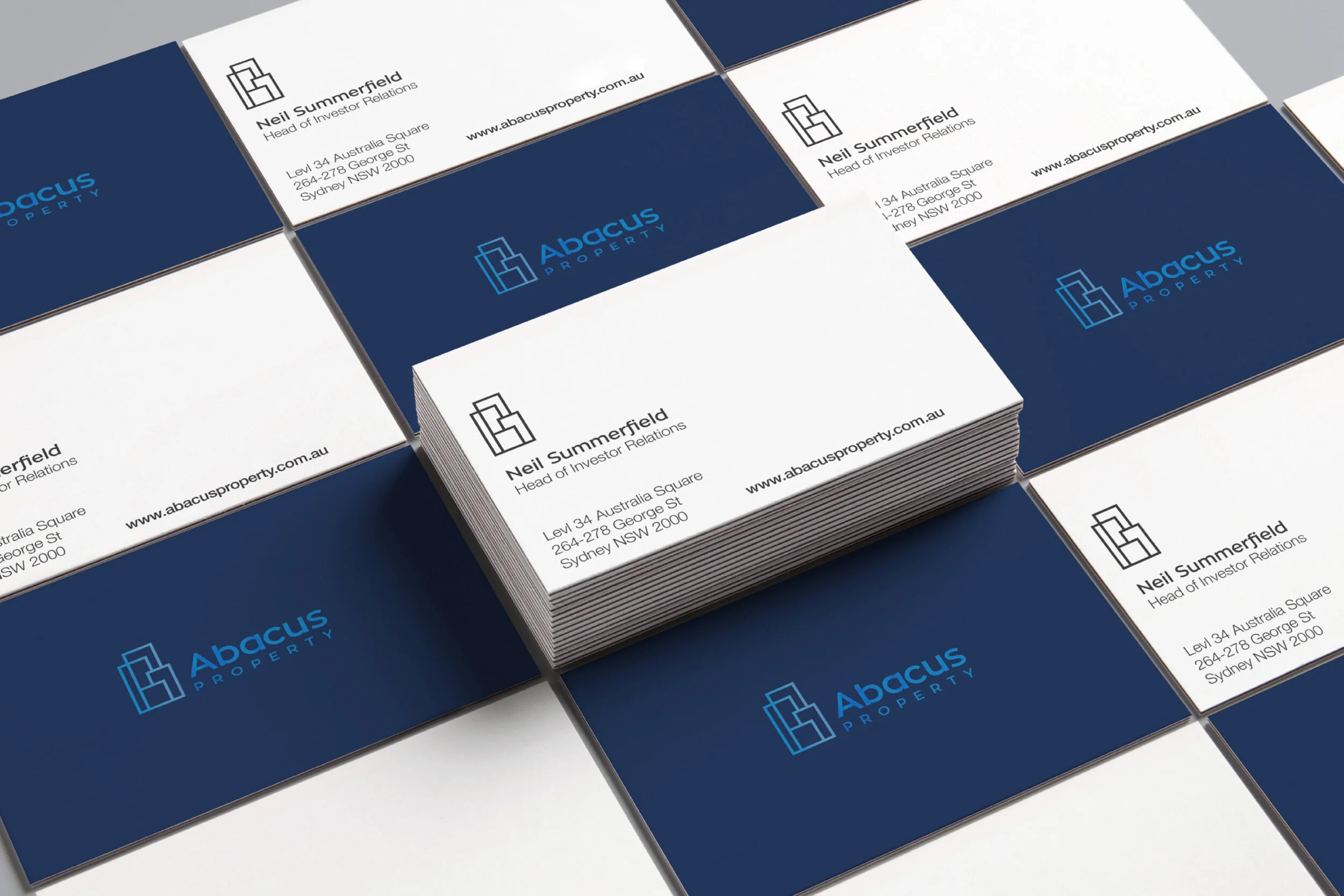
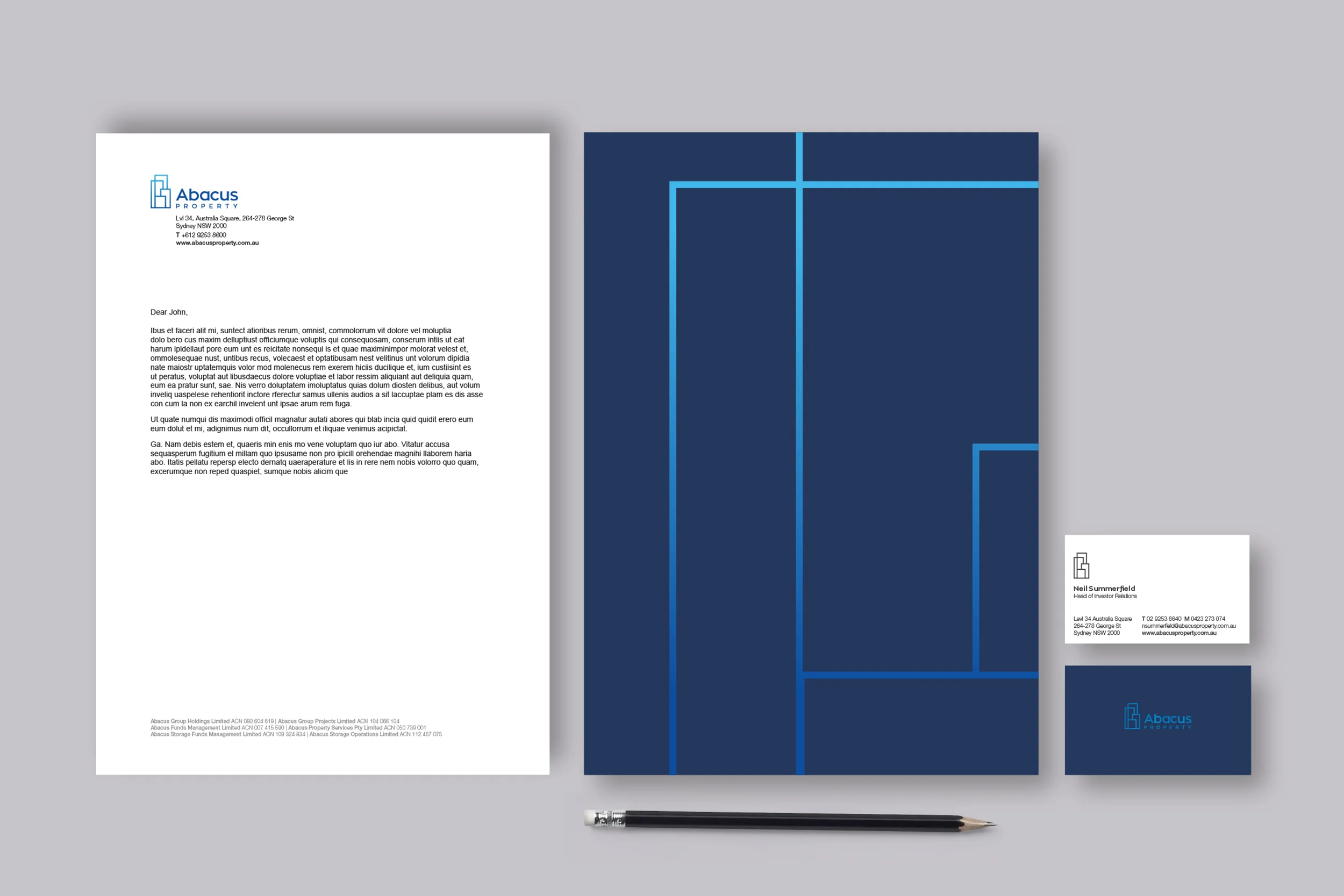
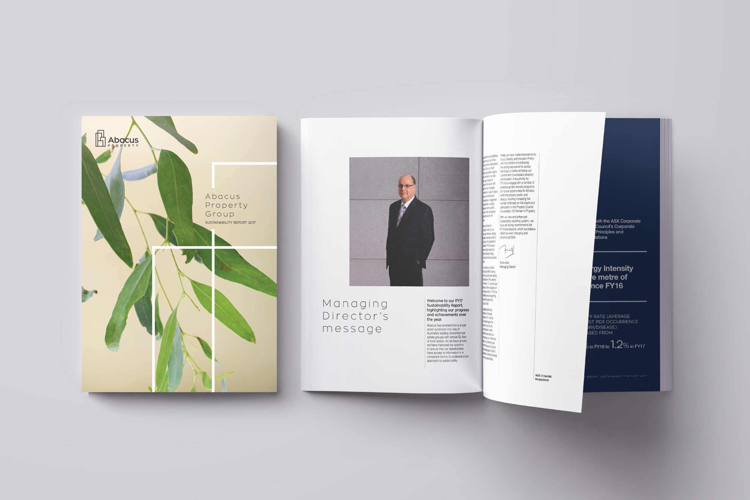
As a linear shape the logo has a lot of room for different executions in collateral pieces – which is a nice way of showing the diversity of the Abacus Property Group.
The result is a strong yet modern logo, that cuts through the existing market.