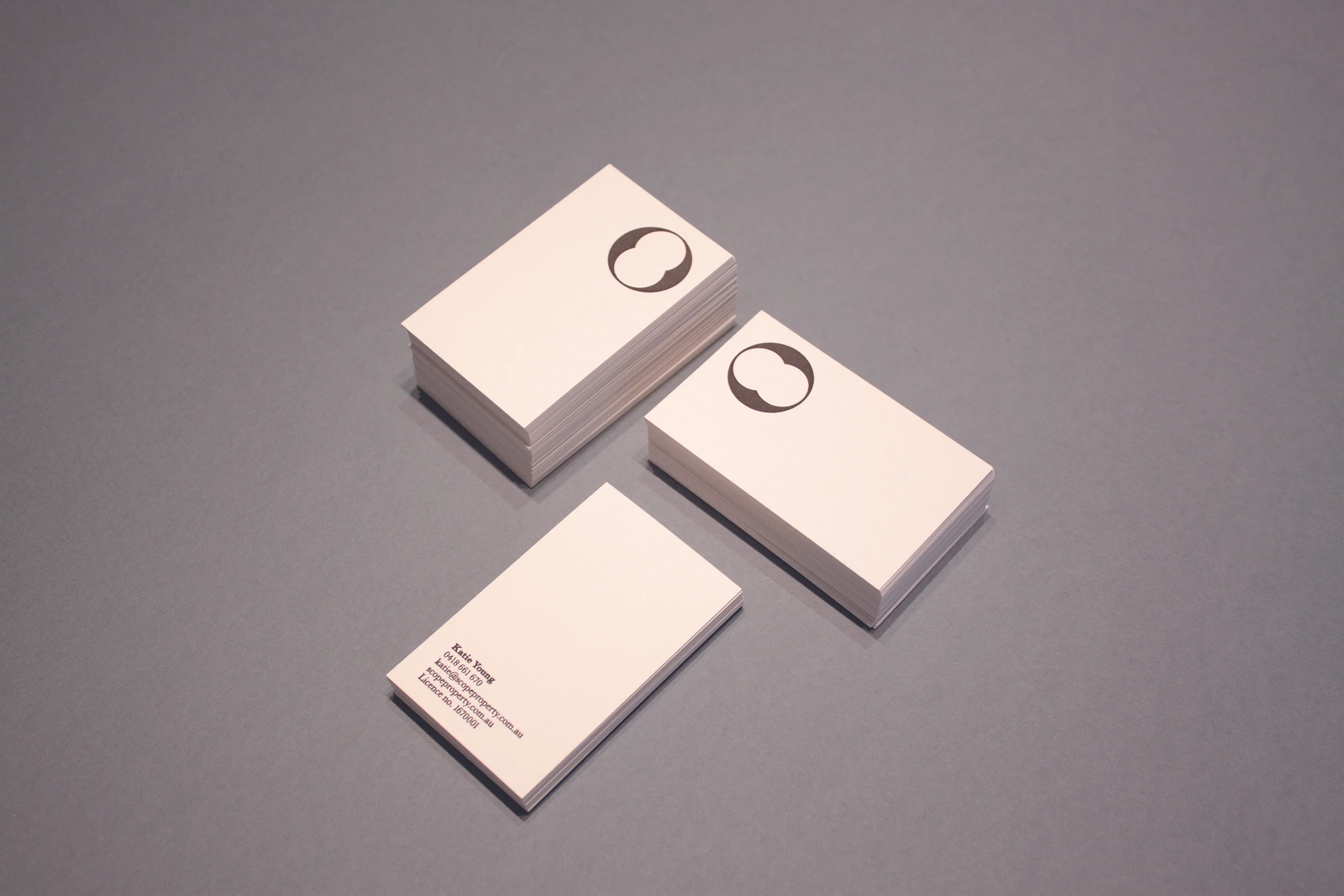

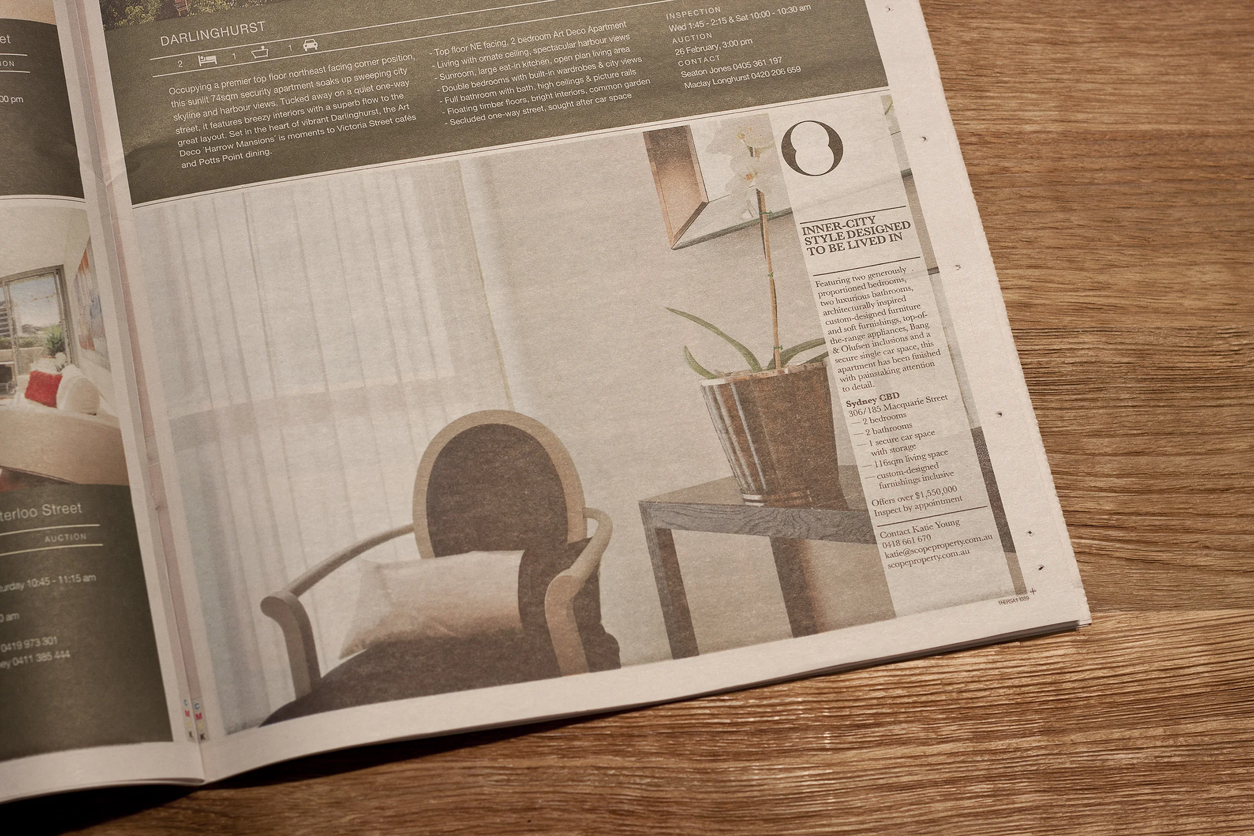
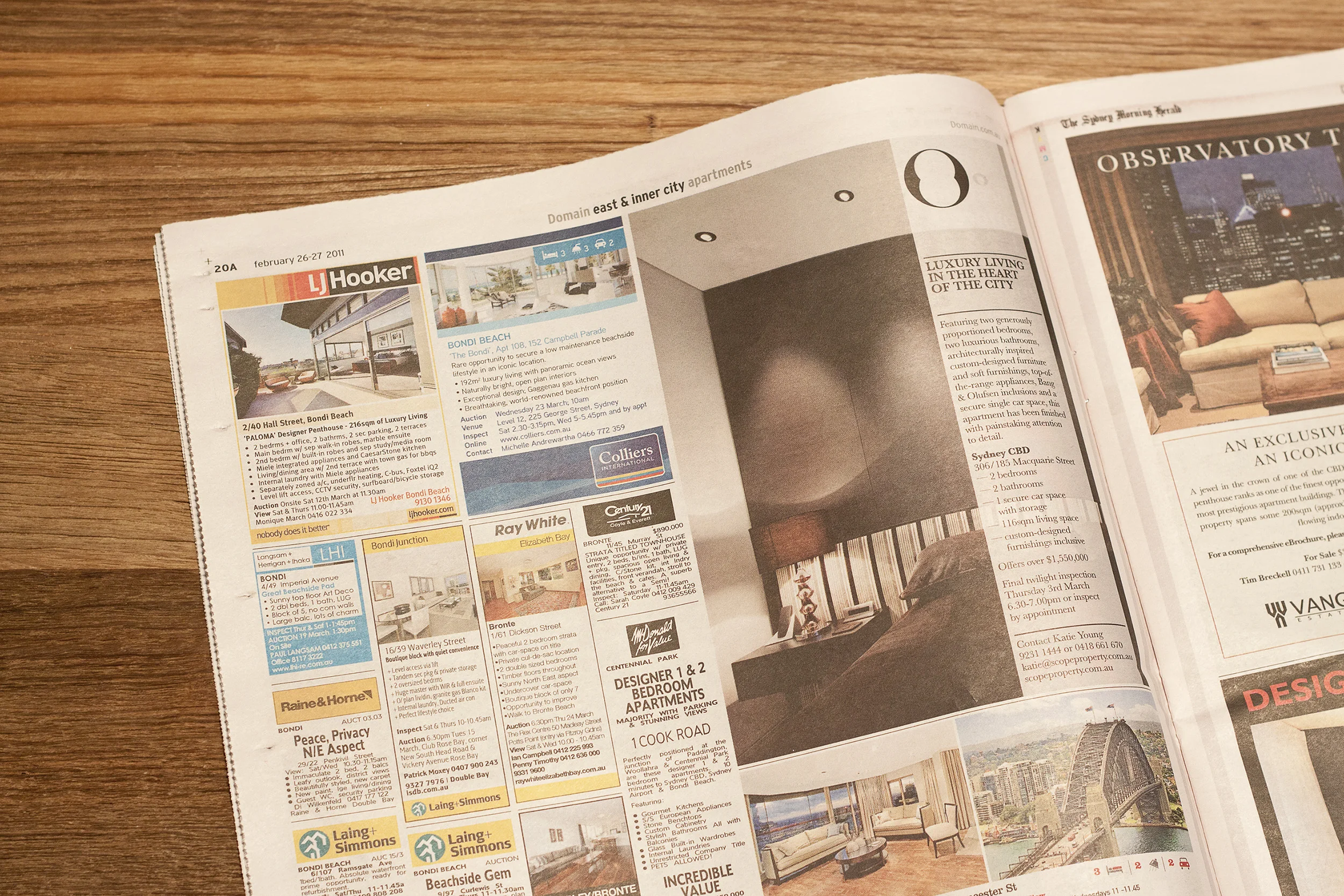
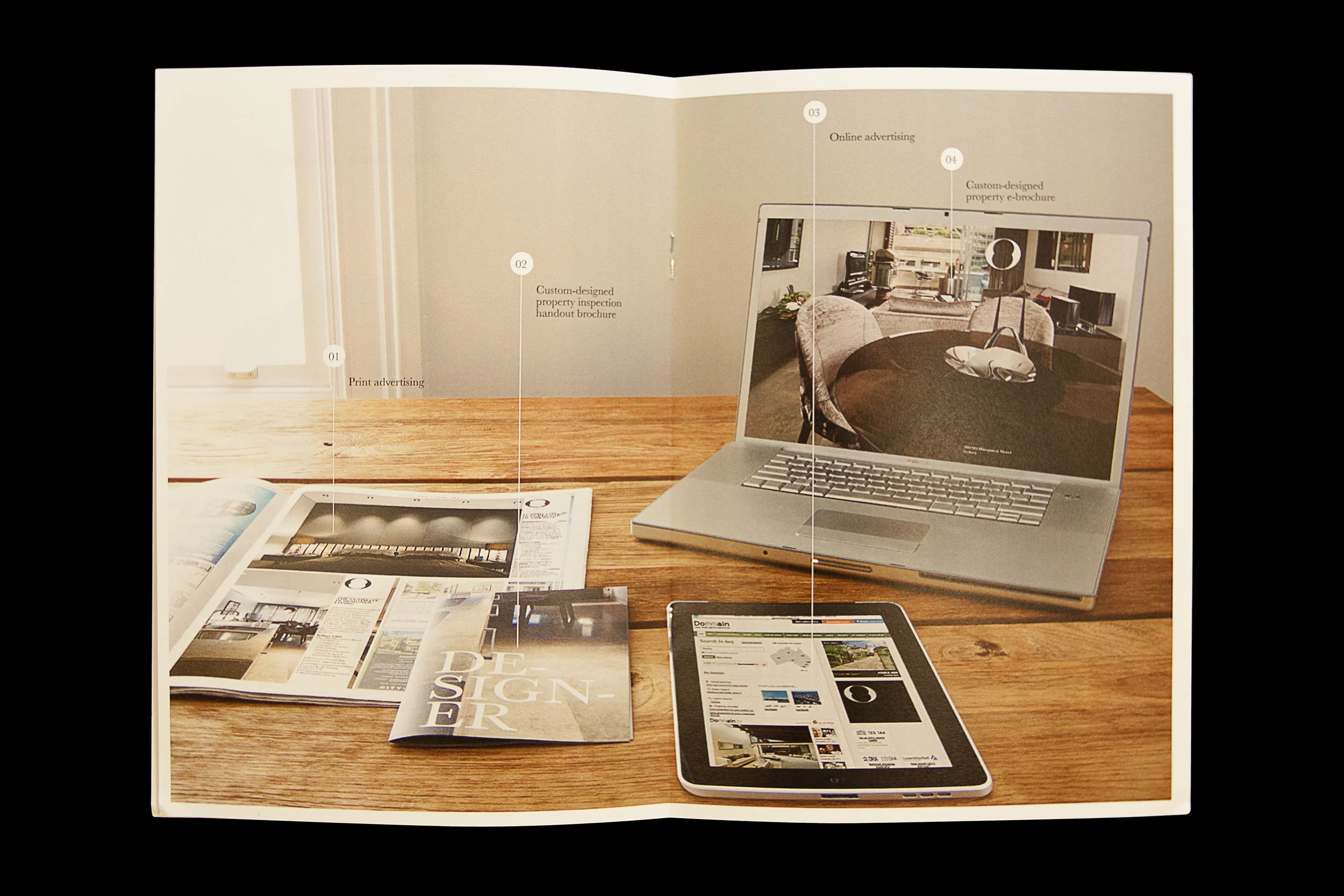
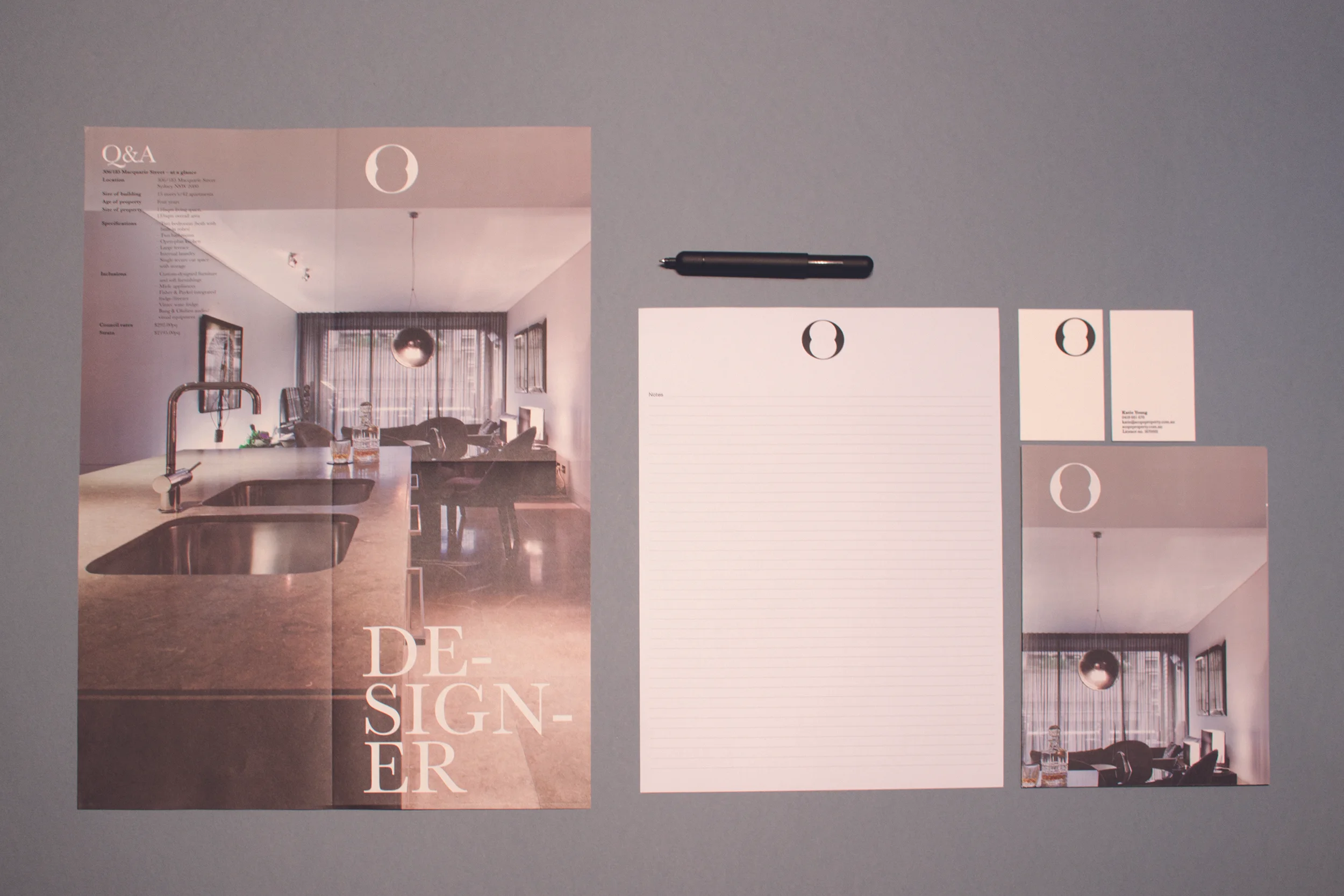
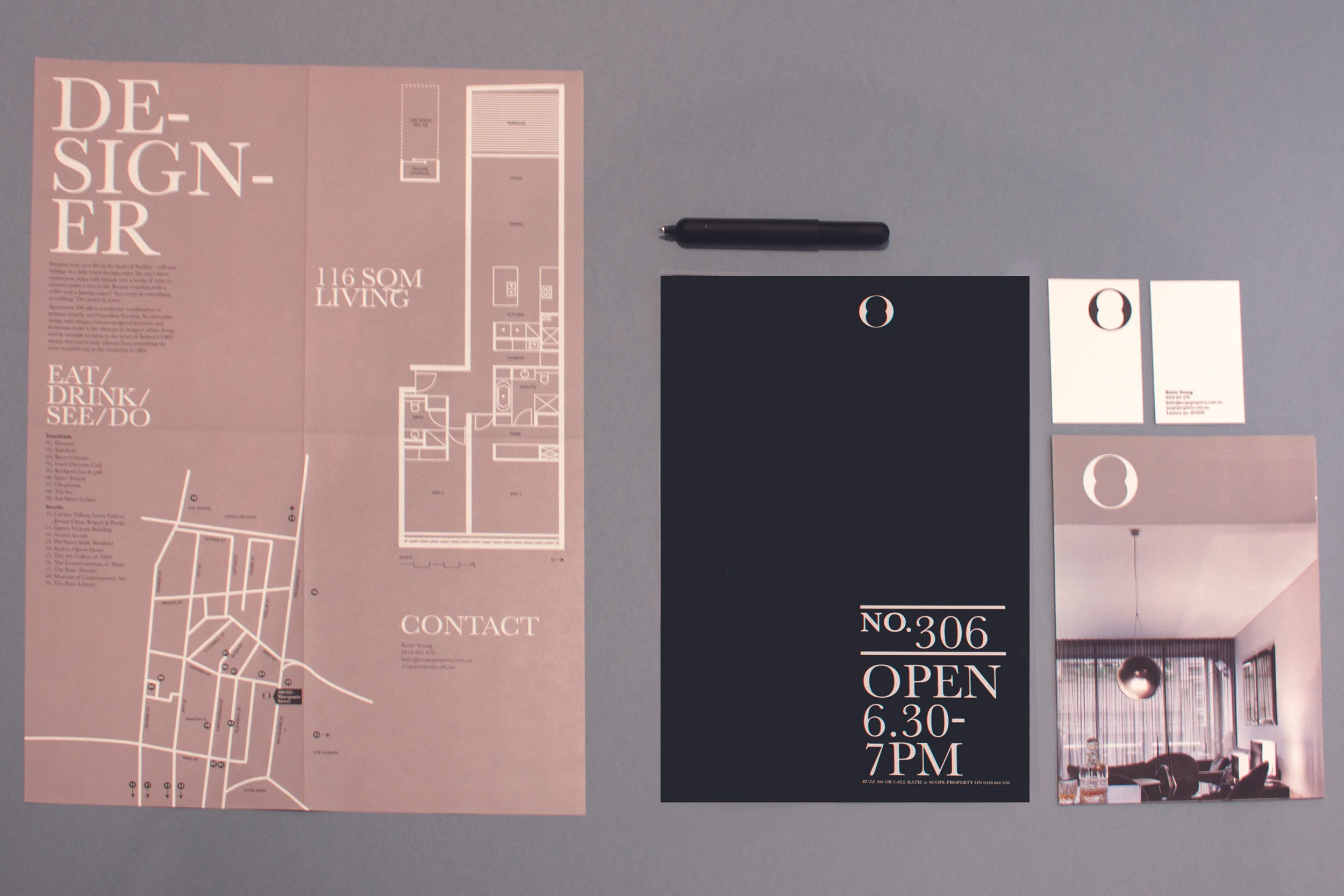

It’s no secret that real estate’s a tough game – if you’re going to succeed, you need to stand out from the crowd. That’s why team scope was so excited when Sydney’s most dynamic new property consultancy asked us to create its brand identity – and because Scope Property’s director is our very own Katie Young, we knew she would be happy for us to really let our creativity loose! Scope Property is all about ‘engaging people with property’ and we think that the first step to doing that is getting people to engage with the brand. We started with the logo – individually, the two overlapping circles represent buyers and sellers, but together they form a stylised keyhole that symbolises how scope property helps people unlock their perfect property opportunity. Next we designed ultra-glam letterpress business cards and collaterals, and backed them up with a stunningly elegant website, which provides the perfect backdrop for showcasing the luxury homes that Scope Property brings to market.